How We Got Here
In my head, I’ve designed this portfolio a thousand times—each version driven by a different reason, a different audience. I’ve explored platforms like Framer, Webflow, and others, chasing structure, trends, and convenience. But with every iteration, I came to realize: each one only served a purpose in that moment—none truly reflected who I am.
I found myself designing to impress recruiters, appeal to clients, or fit neatly into whatever was trending in the ecosystem. And somewhere in the middle of all that noise, I disappeared. Until now.
This version of my portfolio is different. It’s not about hype or performance—it’s about expression. It’s a space where I’ve chosen to show up as myself. A reflection of my beliefs, my sensibilities, and my creative rhythm. It’s the product of a search for something timeless, futuristic, and quietly confident—an interface that communicates my design DNA without needing to explain itself.
This is that iteration worth a thousand words. This is ME
Typography
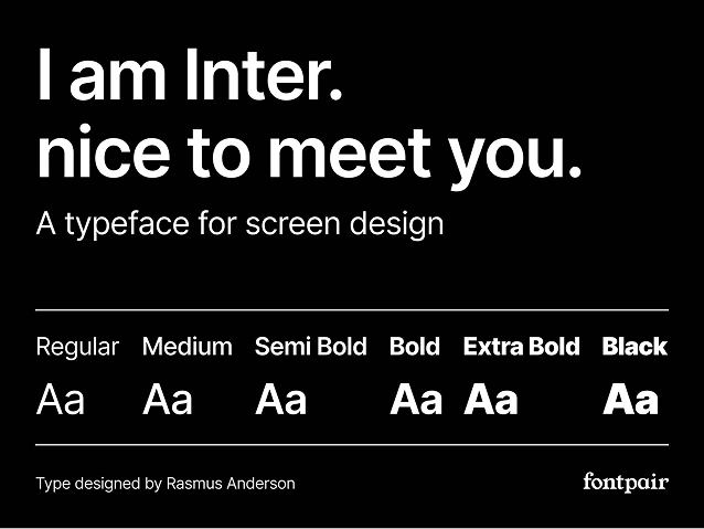
As a designer, I’ve collected an extensive library of typefaces over the years—ranging from Google Fonts to proprietary fonts used in various projects and organizations I’ve worked with. I have a deep appreciation for many typefaces, including Helvetica, the SF Pro family, and Roboto.
For this portfolio, however, I chose Inter as the primary typeface. Inter stands out for its clarity, modern aesthetics, and versatility across screen sizes. Originally designed for digital interfaces, it offers excellent readability and a neutral tone that allows the work itself to take center stage. Its open letterforms, generous spacing, and refined curves make it a reliable choice for both headings and body text.
In a space where typography should support, not overshadow, the content—Inter does exactly that.
 Read all about the Inter Typeface
Colours
This portfolio is built on a minimalist black-and-white palette, chosen to reflect clarity, structure, and focus. Black and white offer timeless contrast and allow the work itself to take visual priority, free from unnecessary distractions. This restraint is intentional, mirroring my design philosophy: purposeful, content-first, and distraction-free.
To introduce hierarchy and guide interaction, I use a single accent colour: #0969DA, a strong, modern blue. It appears sparingly—on interactive elements like links, hover states, buttons, and icons—providing visual cues without overwhelming the layout.
Beyond aesthetics, accessibility is a key consideration. The blue accent meets recommended contrast ratios for readability against both white and black backgrounds, ensuring that navigation remains usable and inclusive for all users.
This disciplined approach to colour creates a calm, focused environment where content leads, and design supports—quietly but effectively.
Technology Stack
This portfolio was designed and built with a focus on speed, accessibility, and maintainability.
The frontend is powered by HTML, CSS, and JavaScript, with lightweight enhancements to keep performance fast and the experience smooth across devices. I chose to avoid heavy frameworks to maintain full control over layout and responsiveness, aligning with the minimalist aesthetic.
Typography is served via Google Fonts, and the site is fully responsive, tested across modern browsers and screen sizes. Every line of code is written by hand to reflect intentionality and precision.
The project is version-controlled using Git, and deployed through Vercel, allowing for fast updates and a streamlined workflow.
The stack is simple by design—lean, readable, and purpose-driven—just like the portfolio it supports.
Tools Used
This portfolio was crafted using a selection of tools that support clarity, efficiency, and creative control throughout the design and development process:
- Figma – For wireframing, visual design, and prototyping. Its flexibility and real-time collaboration features made it the ideal choice for translating ideas into structure and layout.
- Visual Studio Code – My primary code editor, chosen for its speed, extensibility, and developer-friendly experience.
- Google Fonts – For fast, reliable font delivery and typographic consistency across browsers.
- Git & GitHub – For version control and collaborative development, ensuring a clean, documented workflow.
- Vercel – Used to host and deploy the site, enabling fast performance and seamless updates
Inspiration & Mentions
This portfolio is shaped by a blend of personal design philosophy and the influence of creators, ideas, and systems that prioritize clarity, utility, and restraint.
You can explore my inspirations and visual references on Are.na — a curated collection of the thoughts, designs, and fragments that informed this project’s direction.
I’m especially grateful to the people who have been part of this journey—a journey that, like design itself, never truly ends:
Your support, feedback, and presence have meant more than words can say.